Business
Companies, money, and how they got that way.
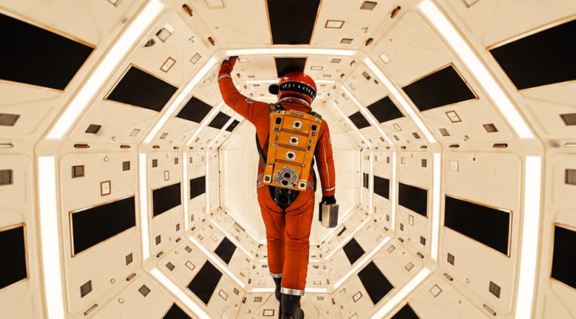
The iPod was named after a line from 2001: A Space Odyssey. Freelance copywriter Vinnie Chieco suggested the name after seeing a prototype and recalling the film's line about opening the pod bay doors.
The BMW roundel uses the colours of Bavaria, where the company is based. The blue-and-white quarters echo the flag of the Free State of Bavaria — shown in reverse, because trademark law forbade using a state's symbols directly in a logo.
The Starbucks logo is a two-tailed siren from European folklore. The figure is a melusine — a mermaid with twin tails — chosen in 1971 to evoke the sea and the ocean voyages that once carried coffee.
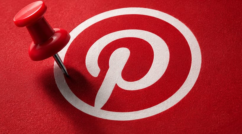
The letter P in the Pinterest logo is shaped like a pushpin. Look closely at the letterform and the stem of the P tapers to a point — a quiet nod to pinning things to a board.
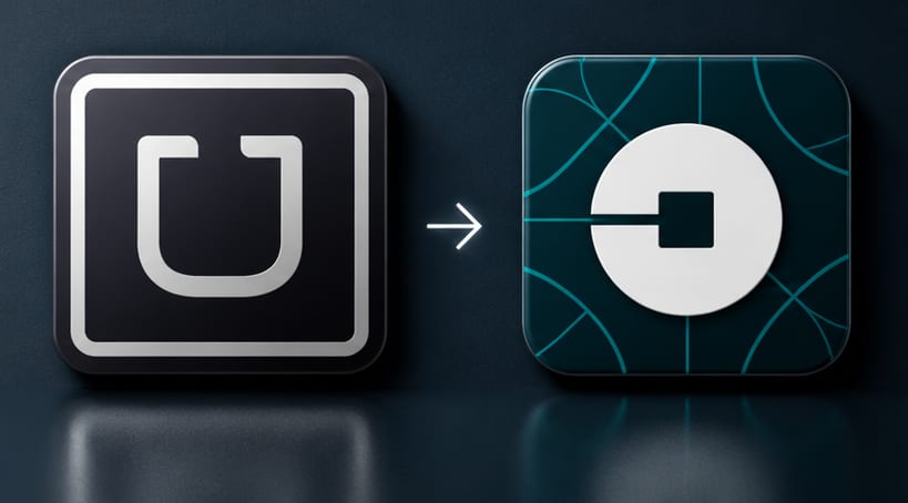
Uber once redesigned its logo to look like an atom. A 2016 rebrand replaced the familiar "U" with an abstract mark meant to suggest that Uber's cars, like atoms, are everywhere.
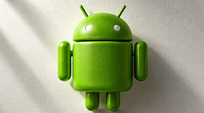
The Android robot was inspired by bathroom door signs. Designer Irina Blok has said the green figure grew out of studying the simple pictograms used to mark men's and women's restrooms.
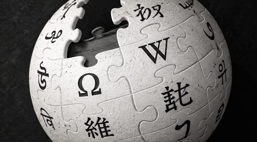
Wikipedia's logo is an unfinished globe made of puzzle pieces. Each visible piece carries a glyph from a different writing system, and the gaps near the top are deliberate — the encyclopedia is never complete.
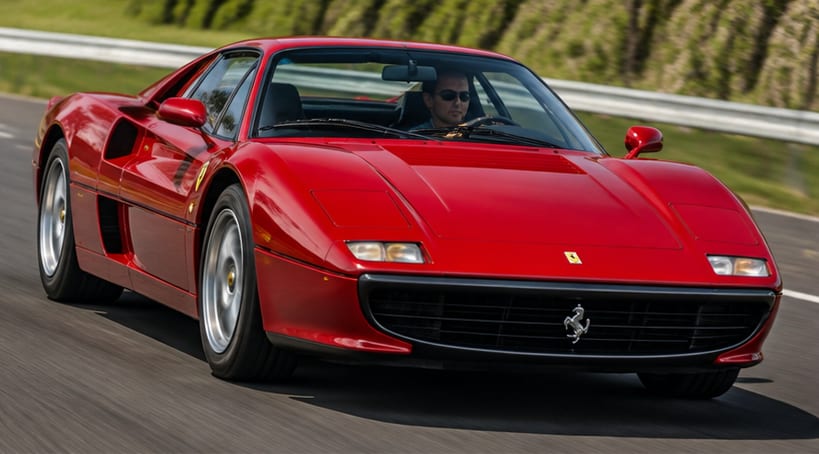
Ferrari's prancing horse came from a World War I fighter pilot. The emblem was painted on the plane of Italian air ace Francesco Baracca; his mother suggested Enzo Ferrari adopt it for luck.